A responsive web design is now absolutely essential for all websites. With the rising competition and the growth of the IT industry, companies have keenly been paying attention to user experience. And now the consumers are used to a brilliant user experience. As a brand, it is your job to provide the user an amazing experience regardless of the device or browser they use to check out your website. And that is precisely why you need a responsive web design. And today we’ll talk about the things to be kept in mind while designing a one.
Table of Contents
What Is Responsive Web Design?
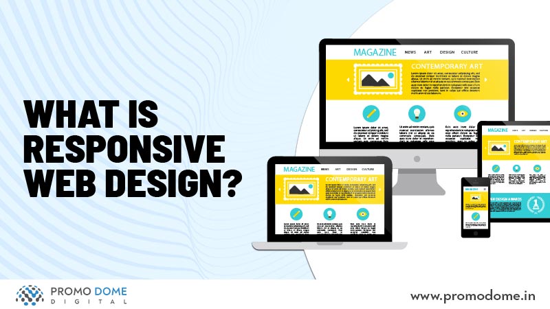
A responsive web design refers to designing the website in such a way that is compatible with all devices, screen sizes, OS’s and browsers. This helps create an amazing user experience and contributes to keeping the bounce rate of your website to a minimum. The more time the user spends on your website the better it is for your direct business and also for your Search engine ranking. A responsive website design can be executed with the smart use of CSS media queries.
Custom Layout
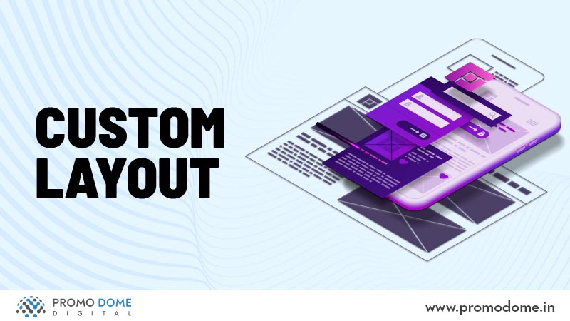
While creating a responsive website, the web designer needs to make sure that he creates custom layouts for extreme size changes. This is can be done efficiently with the help of CSS media queries. You can also choose to change the entire layout with a separate style sheet. The new sheet would just adapt the features from the original sheet and redefine the layout’s structure.
Screen resolution
The screen resolutions of different devices are different and that is why a responsive web design would be one the adapts to it. The Desktop has a 1080p screen resolution, the laptop has a 720p screen resolution, and so on. As an efficient responsive web designer, one should ensure that he adjusts the design as per the screen resolutions.
Flexible Images

A key feature of a responsive web design would be the flexibility of the images used on the website. The web designer needs to plan the images in a way that the key features of all the images are always visible irrespective of the device and its size. Although another way would be to reduce the size of the image. However, that too needs to be done in a way that doesn’t make the design look too cluttered, ruining the user experience.
Content Size

The content size also needs to be optimized for various devices and resolutions. This is essential because I’ll tell you what? Every time I visit a website to read something and it’s causing me trouble, I shut it down right away. And so would the users if they’re finding it uncomfortable to read the content on your website. The content size should be flexible as per the device.
Hide and Seek

Yeah, I know this is quirky. But while creating a responsive web design there are several things you need to consider like what to show and what not to show. For example, on a desktop, you would be able to show a bit of an excerpt of the blog. However on a mobile that might be a problem because there might not be enough space for it. Just like that the features, icons, etc need to be carefully organized and categorized as per priorities. You can also choose to not show unimportant content or images while creating a responsive web design for a smaller device.
A responsive web design is the need of the hour. And you need to make sure that your website is responsive. There are several Digital Marketing firms like PromoDome that can help you build a responsive website that is appealing and enhances the user experience. So get on it and enhance your brand with a responsive web design. For information on Web Designing and its elements read this blog.
